

Brand Development
Digital
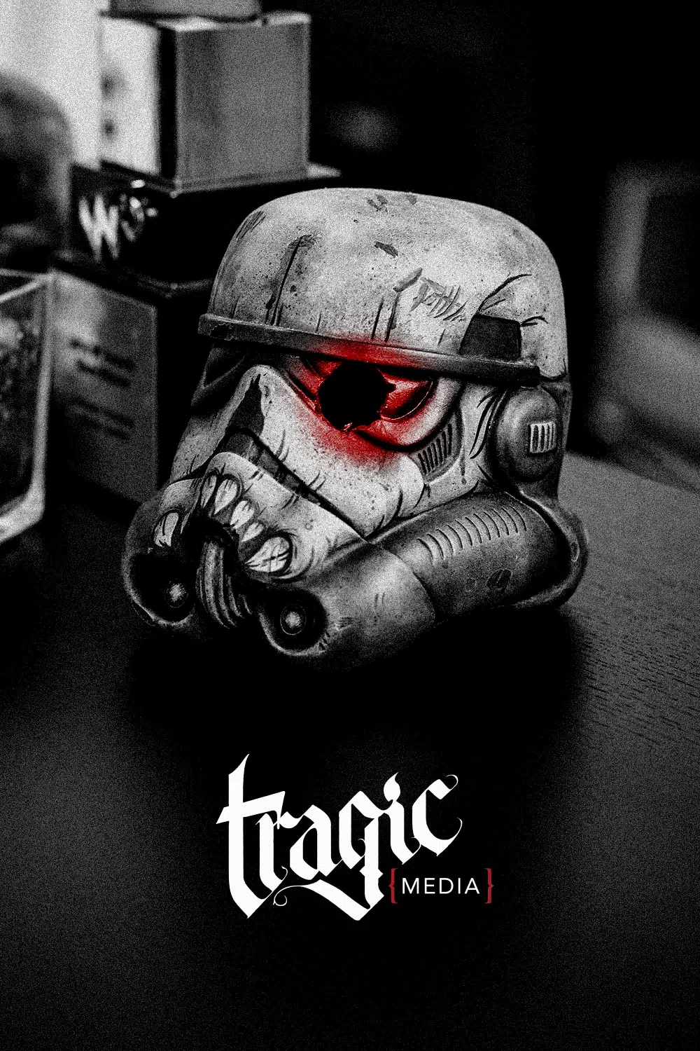
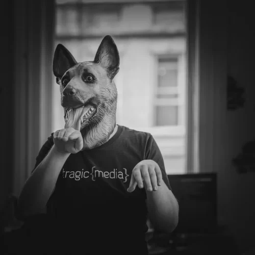
tragic {media}
brand refresh
When tragic {media} brought me in, the agency already had a strong reputation for development and technical execution. The problem wasn’t capability, it was perception.
As the studio began pursuing larger lifestyle and enterprise clients, the existing identity no longer reflected the level of craft the team was capable of delivering. The brand felt visually dated and undersized compared to the premium positioning the agency was growing into.
The challenge was not simply to redesign a logo or refresh a website.
The challenge was to reposition a small but technically elite agency so it could visually compete with larger premium studios while still retaining the authenticity and personality that made the company unique.
The strategic goal
The objective was to create a premium identity system that could support the agency’s move upmarket without losing the independent, artist-driven personality of the studio.
The redesign needed to:
- Elevate the agency’s perceived value
- Position the studio more competitively against larger agencies
- Create a cohesive premium visual system
- Support long-term scalability across digital and print
- Avoid trend-driven aesthetics that would quickly expire
- Preserve the culture and personality of the team
This was not about making the agency look bigger. It was about making the agency look aligned with the quality of work it was already producing.
Design Philosophy
A major strategic decision was restraint.
Rather than chasing contemporary agency trends or overly stylized visual treatments, I intentionally designed the system to feel timeless, confident, and scalable.
The identity system was intentionally restrained to avoid trend expiration, support long-term scalability, and create a brand that could evolve with the agency over time.
This philosophy influenced every design decision:
- typography
- spacing
- photography direction
- motion language
- color usage
- layout systems
- brand applications
The goal was longevity over novelty.
The team wanted a system that could remain relevant for 5–7 years without requiring another major redesign.
That level of restraint required discipline. Every visual decision had to justify itself strategically rather than stylistically.

Creative Direction: Brand & Tone
One of the most important aspects of the project was preserving the atmosphere and personality of the studio itself.
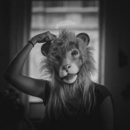
tragic {media} had a distinct internal culture shaped heavily by the founders, artwork throughout the office, tattoo culture, illustration, music, and a strong sense of creative individuality. That energy became an important influence on the final visual language.
Rather than creating a cold or overly corporate identity, I focused on balancing:
- technical precision
- premium presentation
- artistic edge
- human personality
The resulting system aimed to feel polished without becoming sterile.

The Outcome
The rebrand helped create a more unified and premium-facing identity that better reflected the caliber of work tragic {media} was producing internally.
More importantly, it positioned the agency to compete more confidently for larger clients and higher-value engagements.
The project transformed the agency’s external perception from a smaller boutique creative shop into a more mature, strategically positioned studio with premium creative and technical capabilities.
What made the project successful was not visual novelty.
It was alignment.
The new identity finally matched the technical and design acumen of the agency itself.